
GRAPHIC DESIGN AND LAYOUT OF PACKAGING
Marsella is a brand of cleaning products in Peru. This work is carried out to promote two different fragrances for Sachet Softener, such as Nectar of Dawn, Escape, and Petals of Rose and Lavender.
- In some Native American cultures, the sunflower was a symbol representing the deity of the sun. For this reason, we decided to use the sunflower as the graphic element for this concept, aiming to convey the fragrance that emanates in the morning twilight. We employed the brand's basic colors combined with blue tones that denote dawn and freshness.
- Various types of flowers were used to showcase the multitude of species one can encounter when simply escaping. Blue is a hue that communicates the vastness of the sky and sea, where there are no limits, and freedom can be experienced.


Marsella wanted to prolong the scent of its fragrances for a longer duration, so we proposed microcapsules that would extend the detergent fragrance on the garments.
Purple communicates relaxation, and that's why it is the protagonist in this design. The graphic elements used were lavender and roses. Some hints of purity and cleanliness were highlighted, as well as the visibility of the microcapsules in the environment.


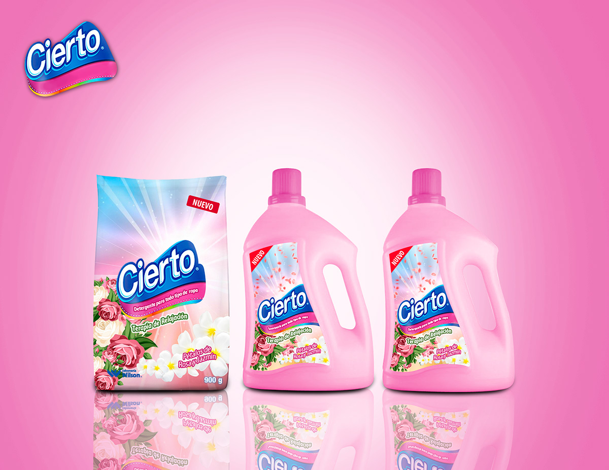
Cierto is a detergent from Ecuador; on this occasion, a fragrance with perfumed salts is proposed to make the scent last longer. The representation of the salts was done with dots of different colors and a gleam of light that symbolizes the persistence and extension of the fragrance.

Certainly, relaxation therapy. We used roses and jasmine petals as graphic elements. Light tones such as pink, which communicates relaxation, and light blue, tranquility, have been employed. It's a color associated with roses and softness.
Éxito Detergent, a Colombian brand. In all three packages, a cyclone is used to represent the blades of a washing machine. In the first concept, capsules of perfume are highlighted, allowing the fragrance to last longer. As the clothes move, these capsules detach, releasing the scent more frequently. Graphically, we use flowers within bubbles that travel everywhere, carrying the fragrance. In the other two concepts, flowers and lemon were used as main graphic elements because it is the fragrance being promoted. Natural representation elements were employed, some combined with a homely feel. Bubbles are a crucial graphic element in this area as they signify detergent. The colors that stood out the most were blue, green, pink, and white, which are associated with cleanliness, nature, and the concepts intended, such as Lemon Scent and Floral Scent.


Familia, Toilet Paper. The brand logo was respected in the design. For the assembly of these concepts, the brand mascot was used alongside the ingredients of each fragrance, extending within the design to communicate a different concept for each. Strong tones combined with fruits and flowers, the main notes of the original fragrance, were used. A combination of splashes and flowers in the air was incorporated to represent the fragrance.


Pañuelitos Elite, Organics, and Power Juices were two umbrella concepts that were managed. Each of these umbrellas falls under a different concept. Therefore, it was necessary to combine each of the elements hand in hand with the fragrance. The combination of some flowers for the organic concept, respecting the original space of the logo.
Power Juice was a concept that required adding some splashes to express the idea. Each of these packages has a different fragrance, so the colors reflected go hand in hand with the main ingredient or tone of the fragrance.


Vitane by Recamier, 4 concepts of Vitane Advance are launched. Vitane offers multiple product lines developed with advanced technological formulas for hair care for both men and women with any hair type. Cleanliness is crucial for the presentation of these products, as they signify technology, purity, anti-pollution, and nourishment. Silver highlights and ample lighting were used to connect with the technological aspect.


Duet, unlike Vitane, is a body soap, a 100% natural product, which demands that its packaging be very clean and maintain a balance within its elements. Here, we can see a combination of splashes (cream) with natural ingredients, such as fruits, oils, and flowers. The corporate line that sets Duet apart from other brands is respected.


